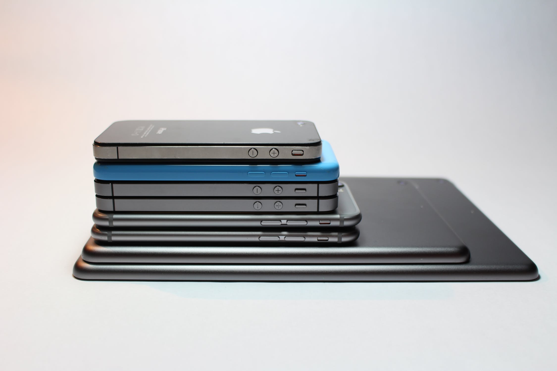
From Steve Jobs to Tim Cook: How did we end up with the biggest and heaviest iPhone in Apple’s history?
 iPhones and iPad
On one hand, a smart phone must be user-friendly and ergonomic for various mobile-based activities – from calling, to listening to music, to surfing the internet, to responding to e-mails. To say the least, that is what Steve Jobs envisioned with Apple back in 2007.
However, Tim Cook, Jobs’ successor, has been carrying a different concept to the physical form of an iPhone. The physical development of iPhone is now geared towards the consumption needs of a number of digital-based product, such as streaming entertainment and social media.
Questions come up based on the statements above: is the current iPhone still considered as ergonomic, handy, or user-friendly as what the late founder believed? Is the ergonomic concept still relevant to most people nowadays? To answer these questions, we created an infographic that shows the evolution of the iPhone’s screen size and weight.
By doing this, we found some key learnings that may help you understand the trend.
- iPhone 11 Pro Max is the biggest and heaviest iPhone ever. This latest model features a 6.5-inch screen and weighs 226 grams. It is almost twice the size of the first iPhone model (iPhone 2G) with a 3.5-inch screen and weighs 135 grams. You can almost put two iPhone 2Gs on the iPhone 11 Max Pro screen!
- All the iPhones from Jobs’ reign are the smallest iPhones ever (2G, 3G, 3Gs, 4). Cook’s reign started with the smallest iPhone (4s), which features a 3.5-inch screen, but the succeeding iPhones started to increase in size.
- iPhone 5 and 5s are the lightest iPhone ever weighing only 112 grams, making these 50% lighter than the iPhone 11 Pro Max.
- There is a 74.3% screen size increment between the first baseline iPhone model, iPhone 2G (3.5 inches) and the iPhone 11 (6.1 inches). The biggest screen size increment per year is 23.4%, from the iPhone 8 (4.7 inches) to the iPhone XS (5.8 inches).
- There is a 43.7% weight increment between the first baseline iPhone model, iPhone 2G (135 grams), and iPhone 11 (194 grams).
- The most common screen size variable of the iPhone is 3.5 inches, which five iPhone models have.
- The average screen size of all 24 iPhone models is 4.8 inches, while their body weight averages 159 grams.
***
Research Methodology:
Each era between Steve Jobs and Tim Cook is defined by the main presenter in Apple's keynote event. For example: Steve Jobs was presenting iPhone 2G during Apple's keynote event in 2007, Tim Cook was presenting iPhone 4S during Apple's keynote event in 2011. All the iPhone models are included with additional specification such as Plus, Max, or Pro version. Specifications of screen size and weight are taken from iPrice’s database.
***
Story by: iPrice Group
ลงทะเบียนเข้าสู่ระบบ เพื่ออ่านบทความฟรีไม่จำกัด


